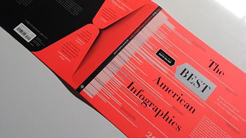
Best American Infographics 2014 Where the Wild Bees are is featured in Best American Infographics 2014. Thanks to Jen Christiansen and Jillian Walters for the great collaboration! October 7, 2014 Related projects Where the wild bees are Making complex research visually accessible How has the bee population changed over the last 120 years, and how has that affected bee-plant interactions? Scientific American commissioned me to design a custom visualization of a complex dataset. More media coverage NOVUM feature Thanks to premiere graphic design magazine NOVUM for featuring me and my work! These Weird Meals Are Actually Clever Data Visualizations WIRED covers Data Cuisine, our project using food as a medium for data expression. La Lettura
Where the wild bees are Making complex research visually accessible How has the bee population changed over the last 120 years, and how has that affected bee-plant interactions? Scientific American commissioned me to design a custom visualization of a complex dataset.
These Weird Meals Are Actually Clever Data Visualizations WIRED covers Data Cuisine, our project using food as a medium for data expression.