emoto

Real-time sentiment visualization
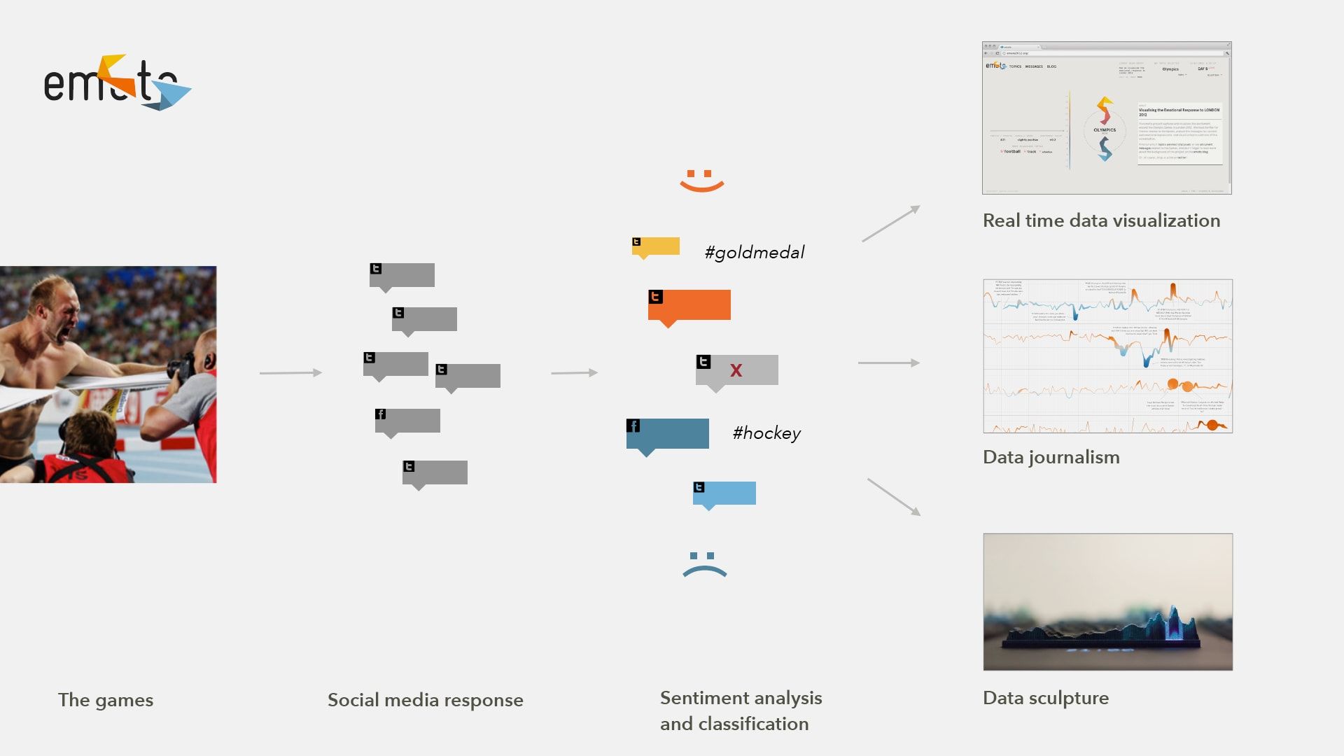
During the Games, we visualized the emotional online response in real-time in a web-based interactive application. Our custom infrastructure consumed the Twitter Streaming API, looking for tweets related to the Olympics and categorized these into sentiment categories (from “happy” to “angry” or “sad” messages). In addition, we detected topics of interest such as disciplines, athletes, nationalities, etc., so in the end we ended up with a real-time sentiment profile for topics relevant to the games. These sentiment profiles were visualized based on a unique origami-like visualization form, allowing easy comparison of how popular or controversial different topics were at a given time. In addition, incoming tweets were visualized in a stream-like message view, featuring an “inverse parallax” effect, where bigger (“more important”) tweets would float more slowly on top, while less cited or referred to tweets were flying by faster in the background.
Story fishing
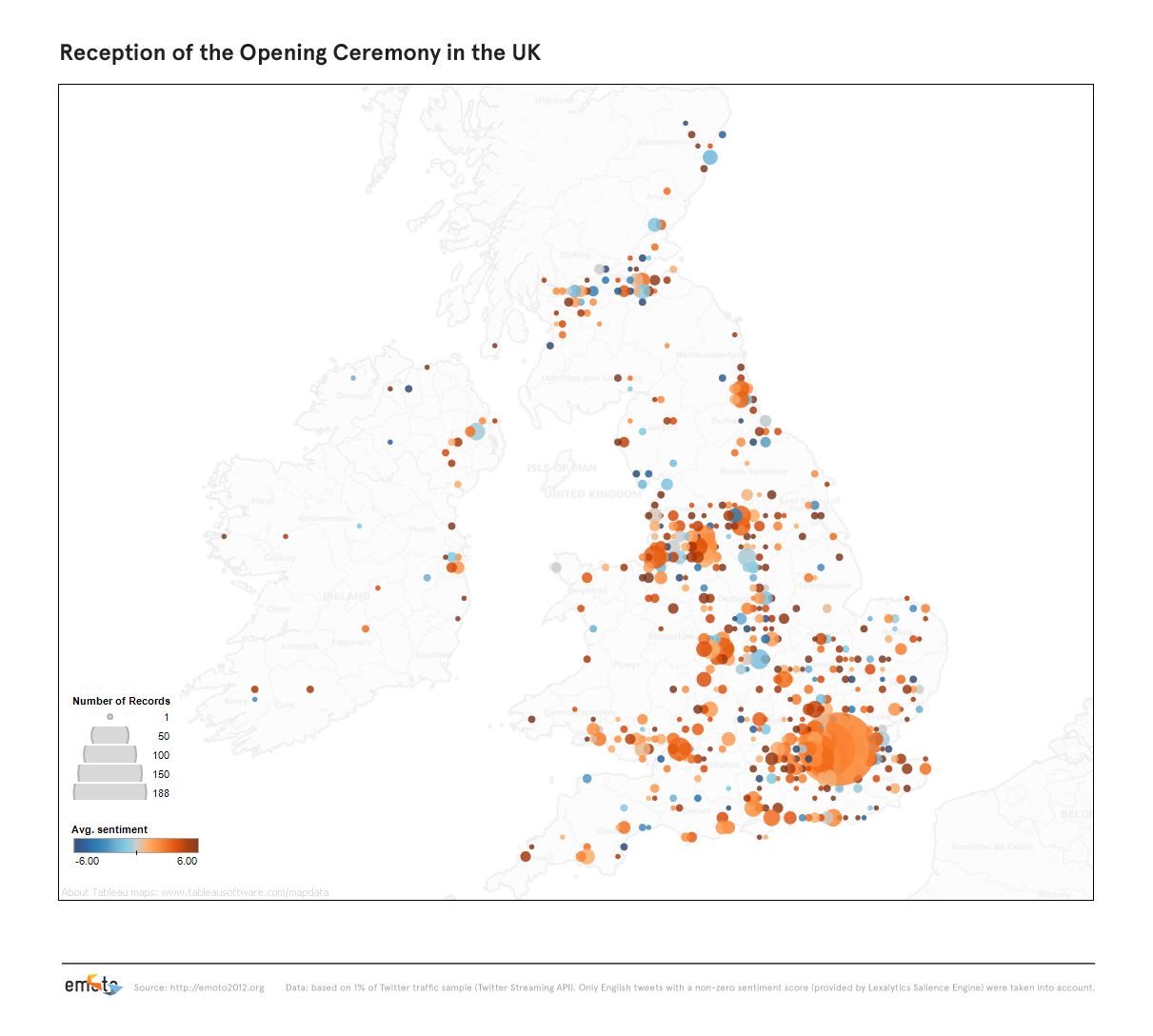
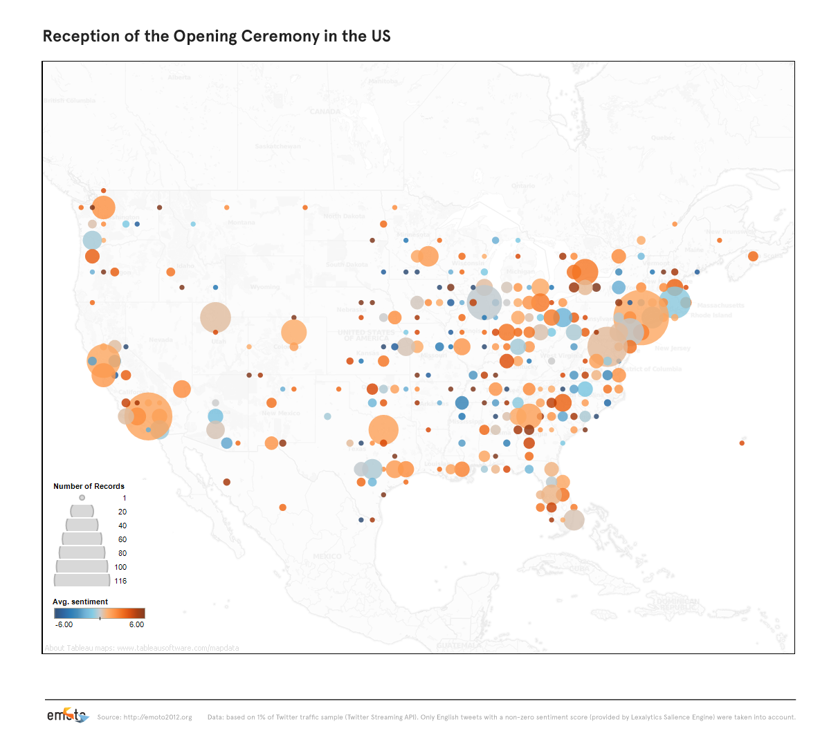
As a complement to the fast-moving, ever-changing real-time popularity contest, we investigated various individual stories, such as the reception of the opening ceremony in the US and the UK, or the sentiment development of individual topics on the opening weekend.
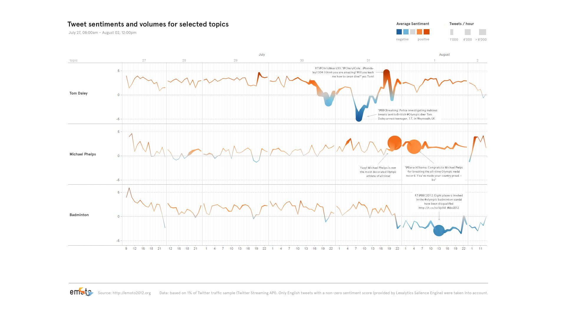
In this context, we developed a chart type we called “sentigraph”, which encodes sentiment in color and vertical position of a line, and at the same time the number of messages in line strength — it proved to be highly effective.
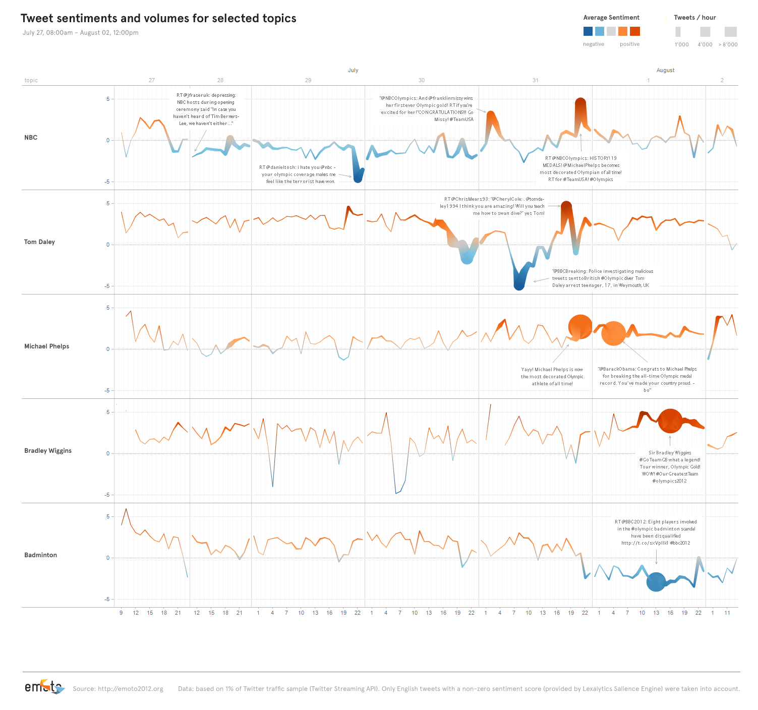
Of course, in the end, we used it to try and to summarize the audience reponse to the games in one l-o-o-o-o-ng timeline.

Data Sculpture
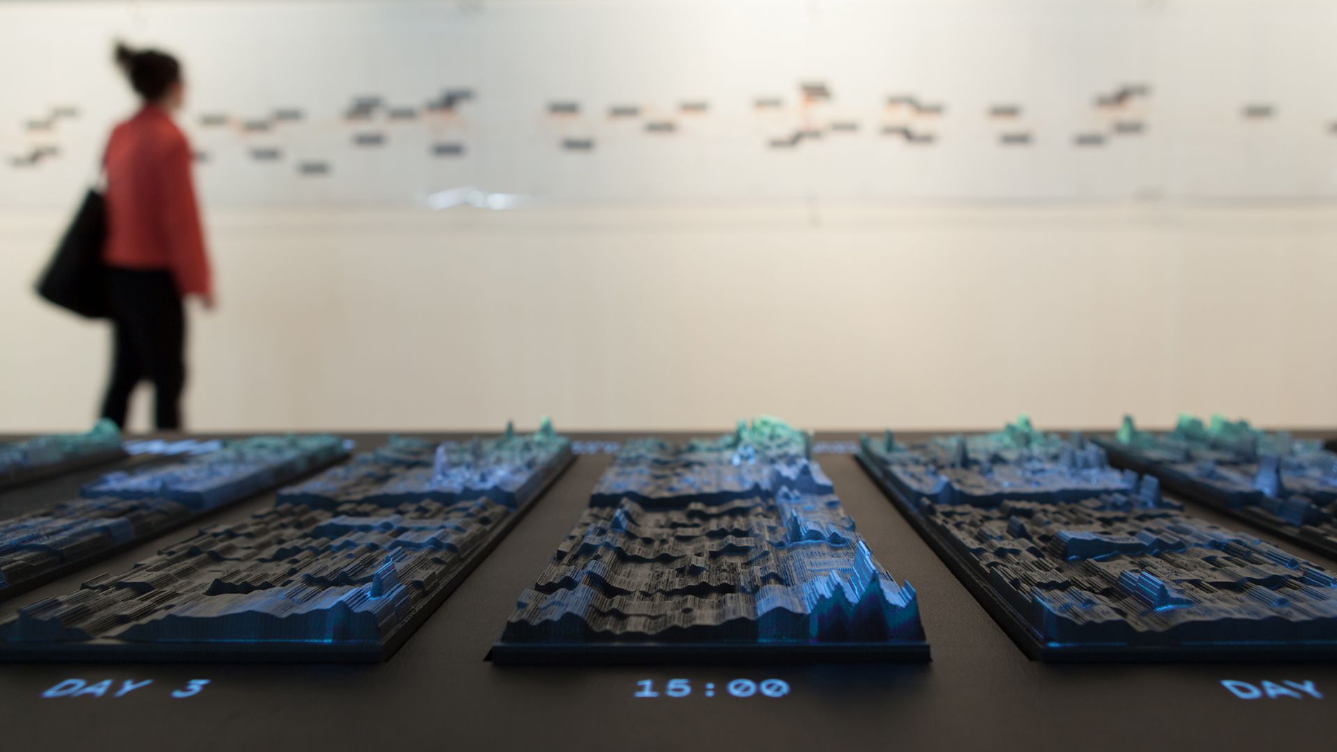
In many ways the crowning piece of the project, and a conceptual counterpoint to the ephemeral web activities, our data sculpture preserved the more than 12 million tweets in physical form. We had 17 plates CNC-milled — one for each day of the games — with a relief heatmap indicating the emotional highs and lows of each day. Overlay projections highlighted individual stories, and visitors could scroll through the most retweeted tweets per hour for each story using a control knob.
The tweets and topics displayed in the installation can be investigated in interactive heatmaps. Rollover the rows to see a tooltip display of the most retweeted tweet on the given topic at the respective point in time.

